Welcome to Matrix Education
To ensure we are showing you the most relevant content, please select your location below.
Select a year to see courses
Learn online or on-campus during the term or school holidays
Learn online or on-campus during the term or school holidays
Learn online or on-campus during the term or school holidays
Learn online or on-campus during the term or school holidays
Learn online or on-campus during the term or school holidays
Learn online or on-campus during the term or school holidays
Learn online or on-campus during the term or school holidays
Learn online or on-campus during the term or school holidays
Learn online or on-campus during the term or school holidays
Learn online or on-campus during the term or school holidays
Select a year to see available courses
Science guides to help you get ahead
Science guides to help you get ahead
In this article, we explain how to analyse film colour palettes so you can critique film and TV like a pro.

Guide Chapters
Join 75,893 students who already have a head start.
"*" indicates required fields
Related courses

Join 8000+ students each term who already have a head start on their school academic journey.
Are you studying a visually beautiful text, but unsure how to discuss the pretty colours? Fear not! In this article, we’re going to explain how to analyse colour palette in films and other visual media.
Want a quick refresher on all key techniques? Check out our Ultimate List of Film Techniques.
In this article, we’re going to discuss:
Watching a film, television show or video game is a very visual experience. Even back before the development of colour photography, individual film cells were often hand-painted, or tinted, in order to further affect the audience. Directors constantly utilise different hues and saturation in order to enhance the text they are creating. Students, in turn, should also be familiar with breaking down and analysing skilful uses of colour in the film!
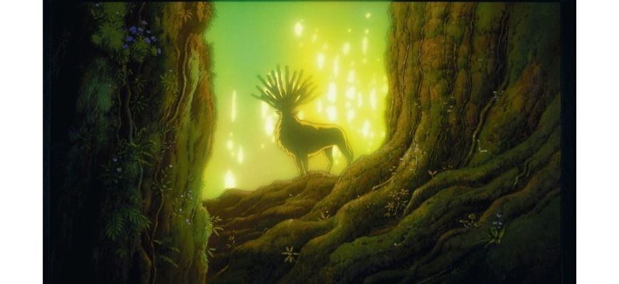

The way a film appears visually and the colour palette was chosen to illustrate the story is extremely important. Using and manipulating colour is a great way to establish certain atmospheres or moods within a film. Colour can also be employed to emphasise elements of the plot or established metaphors. This is because different colours will innately have different psychological or emotional effects on the audience. When analysing a film, it is definitely worth considering: how does the colour impact the tone, or create an extra layer of meaning to the scene?


Before the story begins, even before an actor states their first line, the tone of a film is communicated to the audience through colour. The colour palette of any given film, or visual text, is essentially the visual character, or personality, of that text. Some films may have a warm, comforting palette, and others may have a more dark, futuristic look. There may also be films which switch between various, completely different, colour palettes for different scenes, time periods or locations.
When analysing the colour of a visual text, it is useful to consider these three different categories:
Each of these three categories has the ability to influence the way in which the responder connects with what they are seeing on screen.
Psychologically, different colours will have certain effects on audiences. Red, for example, is linked with emotions such as love and passion, though can also come to represent hatred or violence. Blue, too, can be both calming, and melancholy. The exact emotion you feel that the colour is evoking is completely up to your interpretation, though the context of a film’s story, as well as the saturation and brightness of the colours, may influence their meaning! Darker colours, for example, usually create more negative moods than their lighter counterparts – dark green, for example, can be viewed as ominous, corrupt, whilst a brighter green would more likely be linked with nature and innocence.
It is, thus, useful to ask yourself when analysing colour: what feelings do I think are being evoked due to this use of colour? Is the particular saturation or brightness influencing the meaning?
Create powerful study notes and start writing more insightful essays on film Fill out your details below to get this resource emailed to you. "*" indicates required fields
Download your FREE Film Analysis Planner

Download your FREE Film Analysis Planner
Using particular colour palettes in visual texts can, as stated above, evoke different tones and emotions from the responder. So, directors make very specific colour choices in order to portray different moods and give their audiences more information about the story. While watching a film, or looking at any visual text, it is useful to ask yourself: What do these colours make me feel? How do these colours connect back to the story or characters at large?
Aside from using particular colours to represent particular emotions, the way different colours are placed together in any given scene is also important! Using different schemes and palettes will allow directors to create certain tones, though they may also be used to symbolise different character traits or plot points too. Colour palettes in visual texts can be summarised into those based around harmony, and those based around discordance.
Harmonious colour palettes are comprised of colours that, when combined together, are pleasing to look at. This includes analogous colour schemes (colours that fall next to each other on the colour wheel), and complementary colour schemes (colours that are directly opposite to each other on the colour wheel). When a visual text has a harmonious colour palette, this engages its audience and creates an inner sense of balance.
Here are some examples:
The Velvet Room – Persona 4 Golden
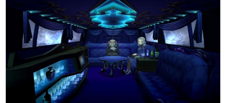
and the colour palette

Within the universe of the Persona 4 Golden video game, the Velvet Room is a place located between the conscious and subconscious, where the evolution of your protagonist is physically manifested. Though the room itself may change form based on who enters it (appearing as a limousine, elevator or jail in different games), the one constant across all versions is the colour. The Velvet Room is draped in this deep royal blue; it smothers every wall, covering each length of furniture. The colour is calming, creating a feeling of security within the room. This is a space for the protagonist to take a break from the game’s challenges, and the harmonious blue tones immediately provide that safe atmosphere.
(See also: the Black Lodge from Twin Peaks (1990-1992, 2017). Fun fact – the original designer of the Velvet Room, Kazuma Kaneko, has stated that the Velvet Room’s blue is actually just an inverse of the Black Lodge’s red interior!)
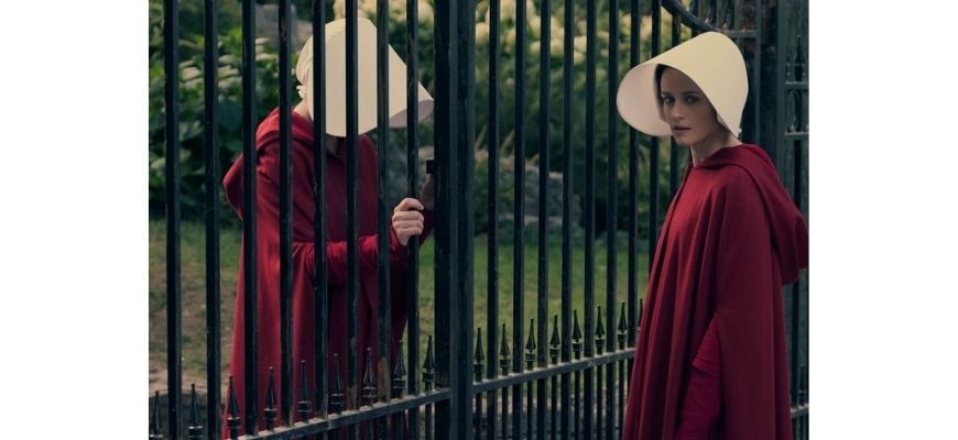
As stated above, complementary colours also create harmonious colour palettes. See, for example, the skilful use of both red and green throughout the Handmaid’s Tale television series:

Colour palettes don’t need to be harmonious to be evocative, however. The use of discordant colours in scenes can throw the scene into disorder, making the entire look of the film seem unbalanced, or off. These colour palettes are those which contrast with each other, usually resulting in a more unsightly combination. However, discordant colour schemes do not need to be ugly in order to be effective. Let’s take a look at some examples:
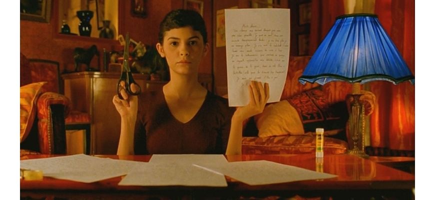
The blue lamp – Amélie:
Amélie centres around its titular protagonist’s journey to better the lives of those around her. Though, even as she aids and interacts with other people, Amélie’s own life is one lacking purpose and fulfilment. Within the film, colour is used liberally to express different emotions. The apartment in which Amélie lives is plastered in red tones, representing her passion and desire for love. However, amongst all her warm-toned decor, Amélie also owns one or two bright blue lamps. Blue, here, contrasts strikingly with the rest of the scene’s colour palette. The lamps become a symbol of Amélie’s more lonely side; her wild imagination, and isolation.

Another, more subtle, example of a discordant colour palette can be seen in Hotel Del Luna’s bridge to the afterlife. The soft pinks and muted blues/greys of the scene create a mystical juxtaposition as the characters stand between the worlds of life and death.
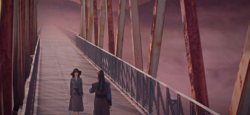

Now that we’ve thoroughly looked into how colour palettes can be discussed in relation to film and visual texts, let’s go step-by-step and break down how you can talk about colour in your essays!
It is first important to identify what hues you can see in a given scene. Is there a lot of, for example, red tones? Are those tones bright, or more muted? Are they lighter or darker in tone?
Take a look at the scene’s colour palette as a whole; do the colours complement each other? Or is there a discordant colour that throws off the balance of the scene?
For example, let’s keep Amélie in mind: Though the scene of Amélie in her apartment is predominately plastered in warm, red tones, a single blue lamp also exists within the space. This creates a discordant colour palette.
Keep in mind that certain colours will psychologically incite certain emotions (for example, red may represent violence or love etc.), though colours can also symbolise character traits or themes from the text. It is completely up to you to decide how you want to analyse the colour palette of a visual text, though keep in mind that you always want to use your techniques to prove a particular theme for a body paragraph!
Using Amélie as an example, the blue lamp can be said to represent her more secluded, childish side. It stands out so harshly against her background, much like how her imagination does when compared to the real world.
T.E.E.L stands for:
Let’s use this structure to analyse the use of colour in Amélie:
Let’s put this together into a sample T.E.E.L paragraph:
Throughout Amélie, directed by Jean-Pierre Jeunet, a warm, nostalgic colour palette composed of harmonious reds and greens is established. However, in some scenes, a contrasting blue colour is added to the scheme, creating a sense of discordance. For example, in Amélie’s apartment, a bright blue lamp sits amongst her countless red/orange belongings. This use of discordant colour represents Amélie’s imagination and seclusion from the wider world. She is an outsider, different in her views and personality due to her unique, isolated childhood. As a result, Amélie is a bright blue lamp within a red and green world, though tries her best to fit into her surroundings and find love regardless.
Here are some other great examples of colour in visual texts, try and think about how you would go about describing them:
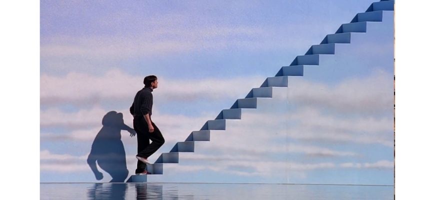

The final sequence from Truman’s journey uses colour to show him in stark contrast to his surrounds.
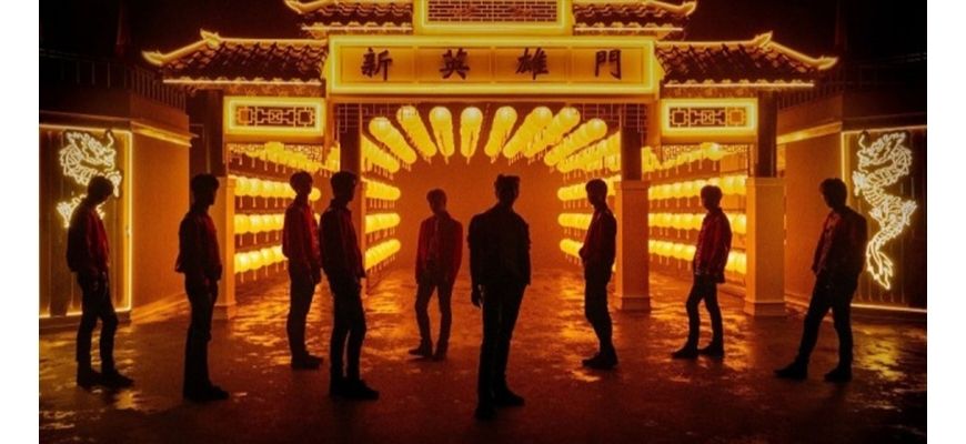

NCT 127 are presented in dark colours contrasted with bright warm yellows.
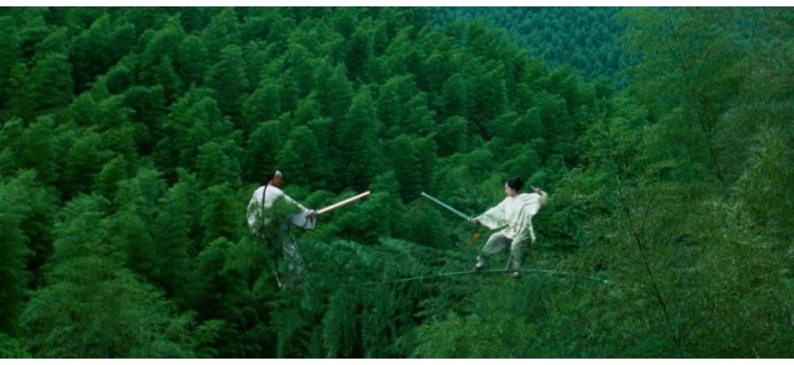

The forest is verdant green in contrast to muted whites of the two fighters.
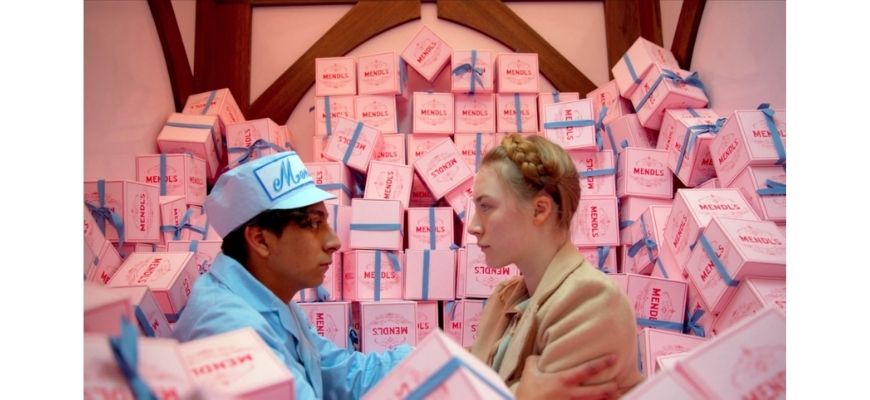

Zero’s baby blue uniform stands him in contrast to his surrounds and shows his innocence and naivete.
Learn how to analyse and discuss music in your English response with Matrix+! We provide you with clear, structured online lessons, resources and feedback to support your learning.
Get ahead with Matrix+ online
Learn at your own pace with expert teachers and proven resources. 96% of students saw their marks improve.
Written by Matrix Education
Matrix is Sydney's No.1 High School Tuition provider. Come read our blog regularly for study hacks, subject breakdowns, and all the other academic insights you need.© Matrix Education and www.matrix.edu.au, 2025. Unauthorised use and/or duplication of this material without express and written permission from this site’s author and/or owner is strictly prohibited. Excerpts and links may be used, provided that full and clear credit is given to Matrix Education and www.matrix.edu.au with appropriate and specific direction to the original content.