Welcome to Matrix Education
To ensure we are showing you the most relevant content, please select your location below.
Select a year to see courses
Select a year to see available courses

In this post, we provide a brief overview of what you will learn in Year 7 Data Collection and Representation.
Understanding Data Collection and Representation provides an important foundation in understanding Statistics: a significant part of future studies in both Maths and Science.
This article will introduce you to data and some of the many ways of representing data in various graphs and tables.
| Stage 4 NESA Maths; Statistics and Probability | |
| Syllabus | Explanation |
| Investigate techniques for collecting data, including census, sampling and observation (ACMSP284) | This means that you can:
|
| Construct and compare a range of data displays, including stem-and-leaf plots and dot plots (ACMSP170) | This means that you can:
|
Data is collected information which can then be analysed and interpreted to draw conclusions and inform our decisions.
Statistics is a branch of mathematics that encompasses the study of data.
There are two main types of data:
1. Categorical (or qualitative) data refers to qualities that can be placed into categories, or function as descriptive information.
Examples of categorical data include nationality and gender, as these qualities can be placed in clear categories.
This data is descriptive and cannot be expressed by numbers.
Nationality can be divided into “Australian”, “Belgian”, “Chilean” and other categories, but nationality cannot be represented by numbers such as \(54\) or \(37.23\).
2. Numerical (or quantitative) data refers to information that can be represented by numbers.
Examples of numerical data include height and weight.
Numerical data can be further divided into two groups:
Data can be collected in many ways, including surveys, questionnaires and even direct measurement.
A real-world example of data collection is the national census.
The census collects data such as age, gender, incomes, occupations and much more to provide an understanding of the Australian populace.
Participation in the census is compulsory, which ensures all Australians are included.
In contrast to large-scale compulsory data collection like the national census, sample surveys collect data from a small sample of the population.
Such surveys are cheaper and easier to conduct.
However, statisticians must ensure the selected sample is representative of the entire population to give a reliable snapshot of the population.
Participants are often selected randomly to avoid surveying a sample that is not representative of the general population.
Collected data needs to be organised and represented in graphical or tabular form.
Then, it can be analysed to draw conclusions.
Join over 4500 students and build strong foundational Maths skills for senior success! Book a free trial now.

Frequency distribution tables are a common way of organising and representing data.
For example,
Example
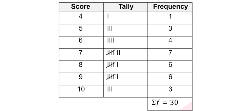
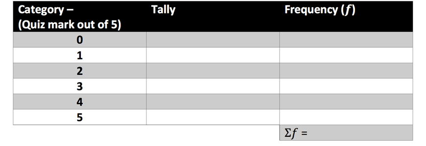
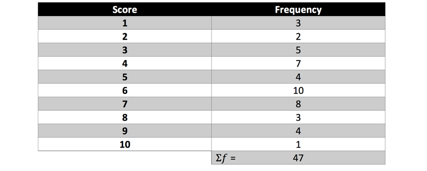
1. A Year 7 Matrix class had the following scores in their weekly quiz:
\begin{align*}
5, 3, 4, 2, 1, 5, 4, 5, 2, 3, 1, 0, 5, 3, 4, 3
\end{align*}
Copy and fill out the following frequency distribution table with the above data.
Then, identify the most common score(s).
Solution:
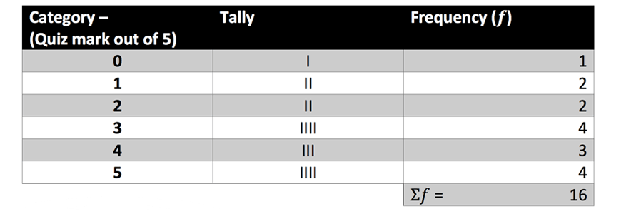
The most common scores are \(3\) and \(5\).
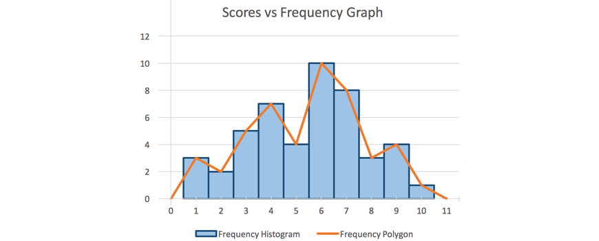
Data can also be represented in graphs.
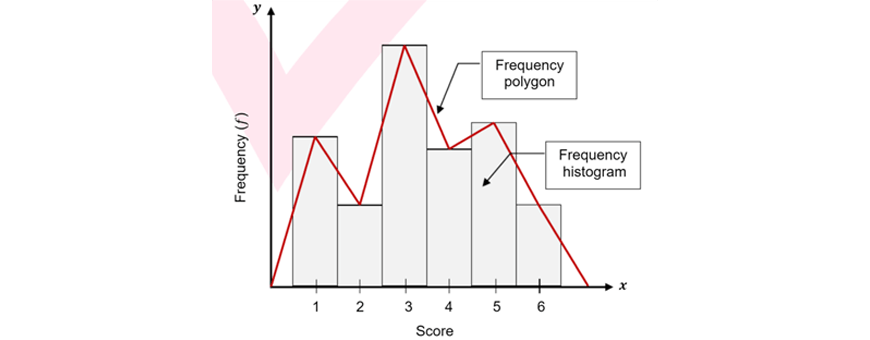
Data organised in a frequency distribution table can produce two types of graph:
Frequency histograms and polygons are suitable for representing numerical data, or categorical data that can be ordered
E.g. age ranges: \( 0-10, 11-20 \) etc.
Key features in frequency histograms and polygons:
Eg. The following graph is an example of a frequency histogram and frequency polygon on the same set of axes.
Example
1. On the same set of axes, draw a frequency histogram and a frequency polygon for the following dataset:
Solution:
A dot plot is a graph that looks like columns of dots stacked on top of each other.
Dot plots can organise and display small sets of unsorted data.
However, they can be time-consuming to read or produce for large sets of data.
For example, The following graph is an example of a dot plot.

Each dot represents a score. All dots are spaced evenly so that the heights of the columns of dots represent the frequency of that score.
Example
1. A group of children are playing in a playground. Each was asked their age. Organise the following dataset in a dot plot:
\begin{align*}
10, 7, 9, 11, 9, 8, 10, 7, 10
\end{align*}
Solution:

Note: your number line does not need to start at \(0\)!
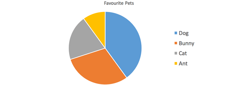
Sector graphs (also known as pie charts) are circular graphs that are divided into sectors to represent the relative frequency of scores.
Sector graphs are useful for representing percentages or fractions.
Sector graphs are most suited to representing categorical data.
Dividing up the graph into too many sectors would be messy and unreadable.
For example, the following sector graph represents favourite sports of year 7 students.
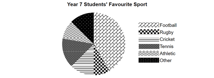
Sector graphs can easily show which categories are more popular compared to others by comparing the area of sectors.
Example
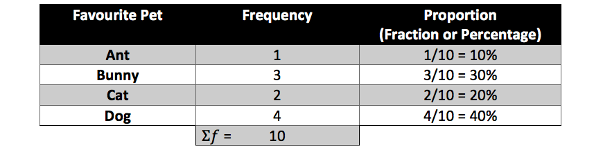
1. A Matrix class was asked what their favourite pet was. Complete the following table and draw a sector graph to represent the following data:
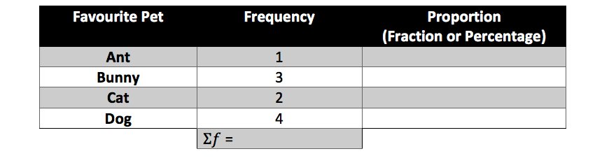
Solution:
Bar graphs use bars of different heights to display data. A frequency histogram is one type of bar graph.
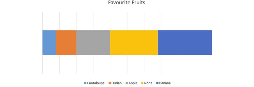
Divided bar graphs represent proportions, or relative frequencies, of scores like sector graphs.
For example, the following divided bar graph shows favourite fast foods.
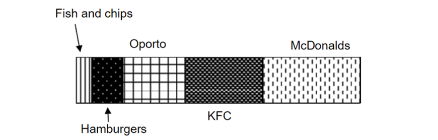
Divided bar graphs also easily show which categories are more popular compared to others by looking at the lengths or areas of different sections
Example
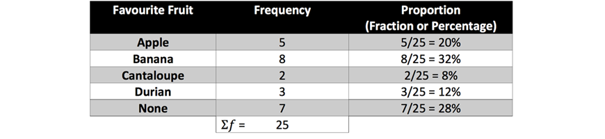
1. Some Year 7 students were asked what their favourite fruit was. Complete the following table and construct a divided bar graph to represent the data.
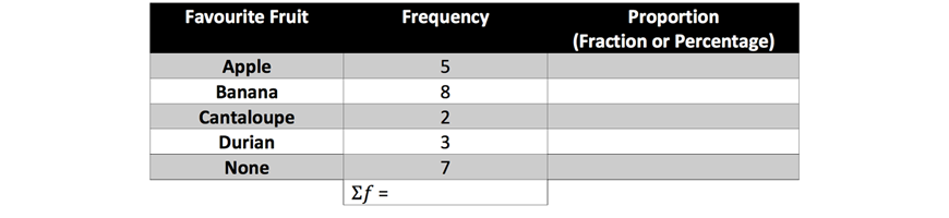
Solution:
Stem and leaf plots are a tabular way of representing numerical data.
Stem and leaf plots look like a column and rows of digits.
For example,
The following data:
\begin{align*}
7, 20, 32, 37, 37, 40, 40, 43, 47, 49, 49, 49, 50
\end{align*}
Would produce the following stem and leaf plot:

Note: the \(‘1 \ stem’\) has no leaves and is empty, whereas the \(‘0’\) in the \(‘2 \ stem’\) refers to the score \(‘20’\).
Furthermore, each row of leaves must be in order, even if the data set you are given is unordered.
Example
1. Given this unordered data set:
\begin{align*}
45, 23, 24, 34, 26, 38, 30, 44, 10, 41, 20, 30, 41, 37
\end{align*}
Construct an ordered stem and leaf plot.
(Hint: first sort data by the \(‘tens’\) digit)
Solution:
Sorting by the \(‘tens’\) digits gives us:
\begin{align*}
&10 \\
&23, 24, 26, 20 \\
&34, 38, 30, 30, 37 \\
&45, 44, 41, 41
\end{align*}
We can then organise the data in a stem and leaf plot:

From this post, you have learnt:
© Matrix Education and www.matrix.edu.au, 2025. Unauthorised use and/or duplication of this material without express and written permission from this site’s author and/or owner is strictly prohibited. Excerpts and links may be used, provided that full and clear credit is given to Matrix Education and www.matrix.edu.au with appropriate and specific direction to the original content.