Welcome to Matrix Education
To ensure we are showing you the most relevant content, please select your location below.
Select a year to see courses
Select a year to see available courses
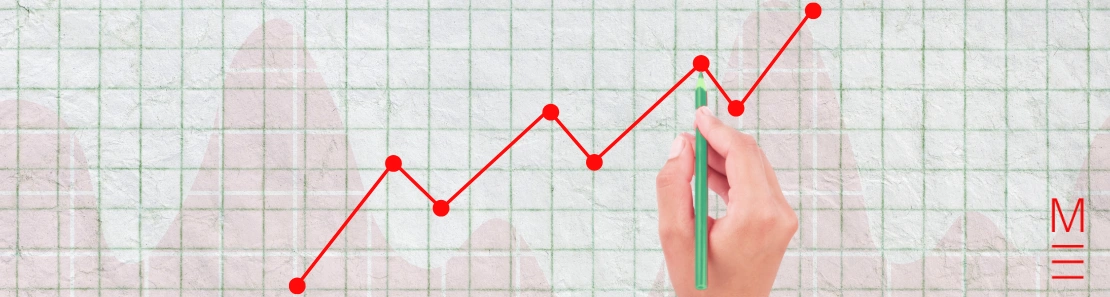
This is the one skill every Year 7 Science student needs to master... so they don’t struggle with it in Year 12! Here's a step-by-step guide on how to draw and interpret scientific graphs.
Join 75,893 students who already have a head start.
"*" indicates required fields

Join 8000+ students each term who already have a head start on their school academic journey.
Learning how to draw and read science graphs is one of the most important skills students develop in Year 7. It’s also one they’ll use all the way through high school, and lose marks on if they don’t get it right early.
Every year, we see capable senior students confidently tackle complex concepts like E=mc² or DNA replication… and yet, some still lose marks because they make simple mistakes on graphing questions (the kind they learnt in Year 7 Science!)
Graphs help us visualise cause-and-effect relationships and predict outcomes based on trends (without testing every scenario).
In this article, we’ll break down the essential graphing skills every Year 7 student should know, from setting up axes to drawing curved lines, with clear examples and a free worksheet to practise.
Table of contents:
Download our free Year 7 Science graphing worksheet and practice with it while you read this guide.
Free worksheet to help you read and understand science graphs! 
Download your free graphing practice worksheet
The most useful graph type for science is most commonly called a scatter plot or a scatter chart.
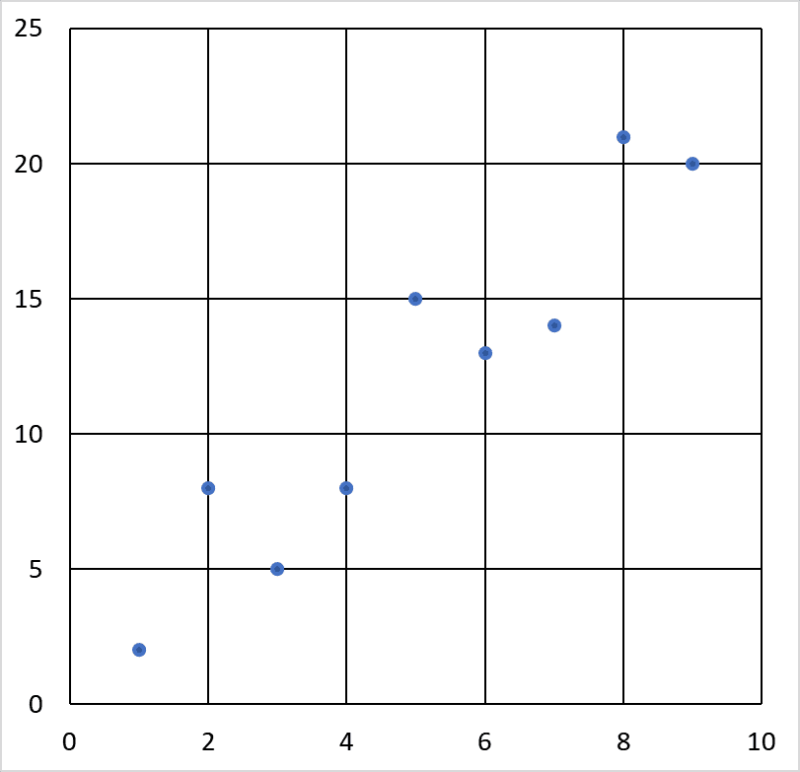
You may have seen something like this in Maths.
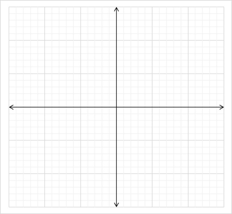
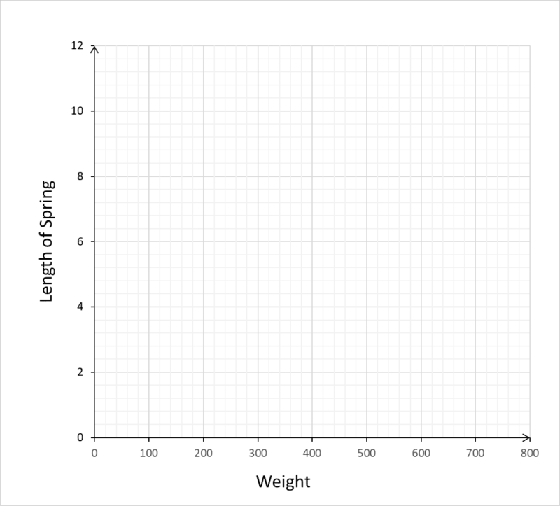
These two lines are called axes. The horizontal line is the x-axis, and the vertical line is the y- axis.
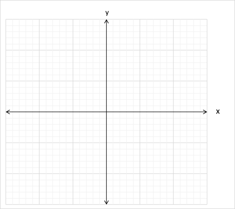
Some graphs will come with numbers already on the axes.
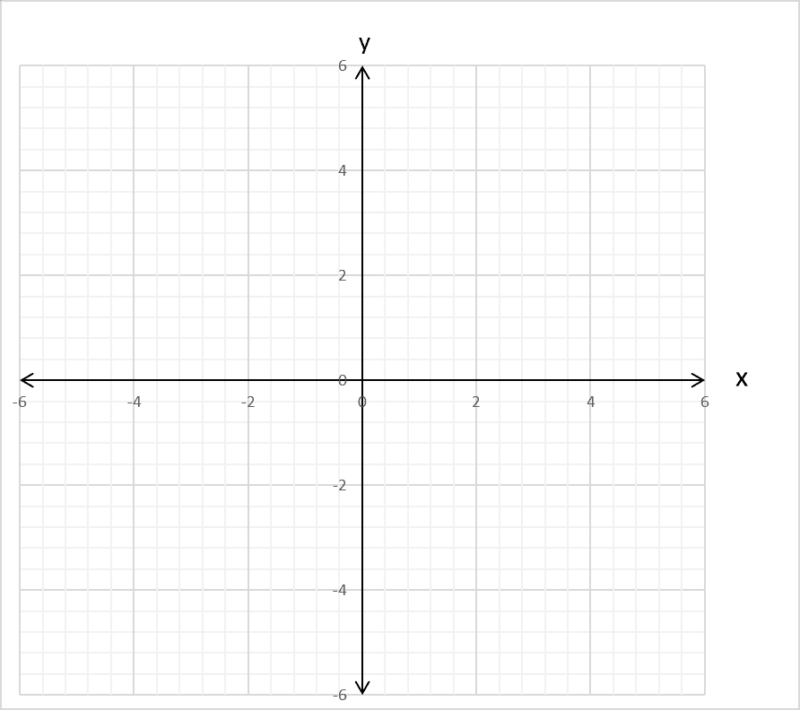
In Science, it’s less common to have negative values. After all, some things that we measure literally can’t be negative, like energy or weight. For Year 7 science graph practice, let’s focus on just the top right part of the grid from now on.
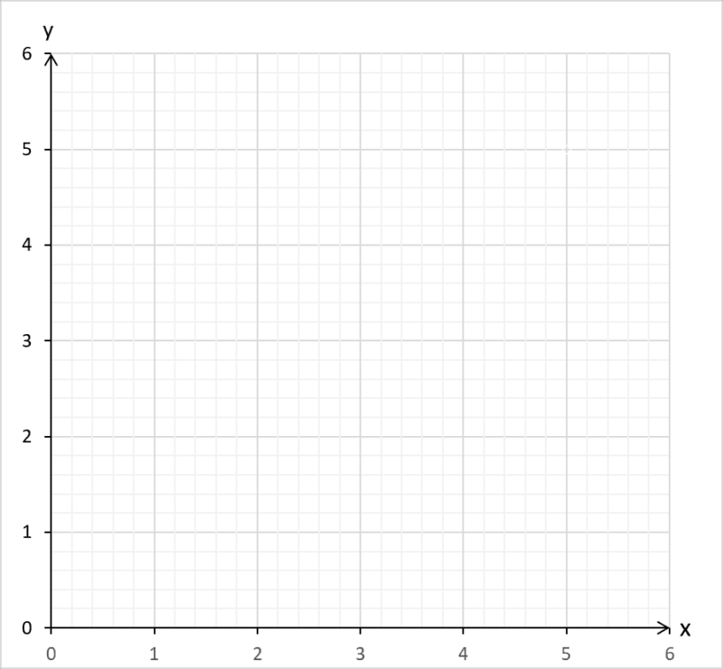
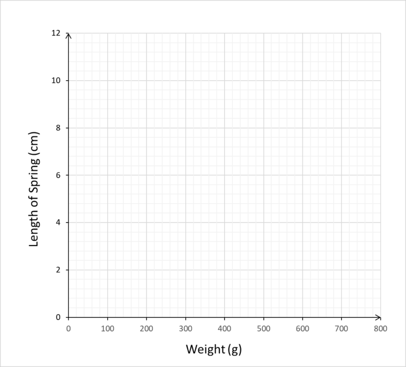
In Science we’ll change the axes from x and y to be our experimental variables instead. For example, we could make x into Weight, and y into Length if those were the things that we measured.
An example of an experiment that uses these variables could be investigating the properties of a spring by hanging different weights off it and measuring how long it stretches to. We’re going to create a graph for an experiment like this and we encourage you to follow along.
There’s a blank version of the axes in the science graph practice worksheet, or you can get a ruler and copy down the axes you see here.
Let’s add our variables now.
But wait! If someone asks you how long something is, you can’t just say “1 length” or “5 lengths”. Are you talking centimetres or metres? You could even mean feet or inches! That’s why all scientific graphs need units with their variables. We put them in brackets behind each variable.
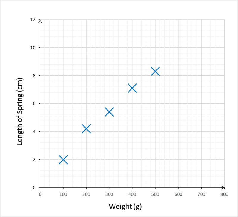
Now that we have labelled axes (they have numbers, variables and units) we can start putting our first data points on. You may get your experimental data in a table like the one below.
| Weight (g) | Length (cm) |
| 100 | 2.0 |
| 200 | 4.2 |
| 300 | 5.4 |
| 400 | 7.1 |
| 500 | 8.3 |
Each row on the table represents one point on our graph. To put the first point on you read across to 100, then up to 2.0. Use your pencil (yes pencil, not pen) to mark the point.
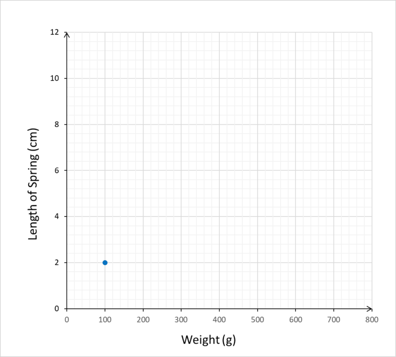
Many students like to put a dot to mark each point. This is the approach you’ll use in Maths, and there are good reasons for that, then. But in Science, we find that pencil dots tend to disappear once we add extra features to the graph. Instead, use a nice big cross which is easy to see, but crosses over at the precise point you need it to.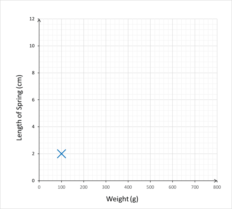
Once you’ve done one, you can do all of them! Depending on your grid paper you may find it very easy to see exactly where each point goes, or you may have to make your best guess, like what we’ve done for values that fall in-between the lines.
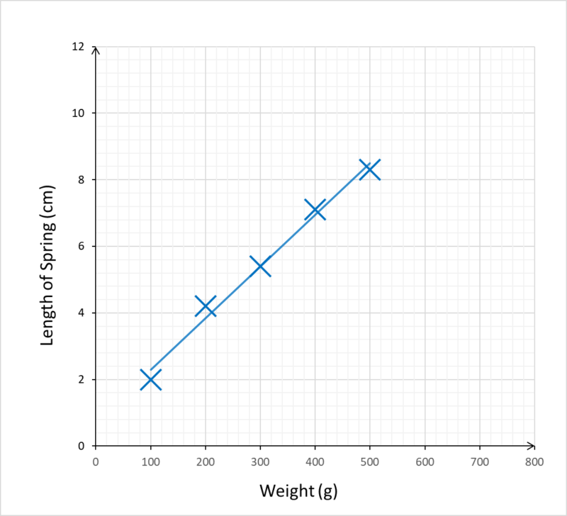
Now here’s what you’re NOT going to do – you’re not going to join the dots. Joining the dots would create a different type of graph called a line graph. It’s valid for some circumstances, but not for this type of experimental data.
What we do instead of joining the dots is draw a trend line, also known as a line of best fit.
The line of best fit shows the common trend that the data follows. All you really need for a line of best fit is a ruler and a pencil. Take your ruler and line it up with your points. It’s likely that most of the points won’t actually be on the line that you draw, but that’s ok! You’re actually aiming to get roughly the same amount of points above the line as you have below the line.
For now, don’t go beyond the first or last value with your line. It should end up looking something like this.
With Matrix, students learn how to draw graphs the right way.
Q: Do I have to start my line on the first point and finish my line on the last point?
A: No, don’t do that. Follow the rule to have an equal number of points above and below the line.
Q: Do I have to start at zero? Should the zero point be on the line of best fit?
A: No. Even if you took a measurement at zero, that point isn’t any more special than any other point, and your trendline might not meet it exactly.
Q: What if NONE of my points are on the line of best fit?
A: You can still be correct!
Q: If I make a mistake, can I scribble it out and start again? What about white out?
A: Your teacher would honestly prefer for you to ask for another sheet of graph paper. If you find you’re needing to have several tries, my tip would be to draw your data points really strongly (once you’ve double checked them, of course!) and draw your trend line really lightly. That way, you can rub out the line without having to start from the beginning.
Q: One of the points seems… really off. What should I do?
A: When points seem to be very far away from the line of best fi,t it’s probably a sign that you’re dealing with an outlier. An outlier doesn’t follow the trend and is usually a sign that something went wrong with that measurement. Here’s an example where somebody made a mistake with their 4th measurement.
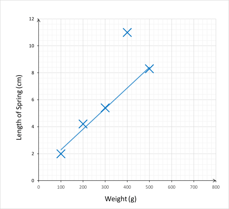
When you’re making a graph, the best thing to do about outliers is ignore them when drawing your line of best fit. When you’re doing the experiment, the best thing to do is redo the measurement!
Now that we’ve got our graph, what can we do with it? Let’s make a prediction. How long would the spring be if a 250g weight were hung off the end?
Logically, you already know that it’s roughly halfway between the 200 g value and the 300 g value. We can use our graph as ‘working out’ to justify our logical conclusion.
Take your pencil and draw a faint, dotted line vertically up from 250 g until it hits the line of best fit.
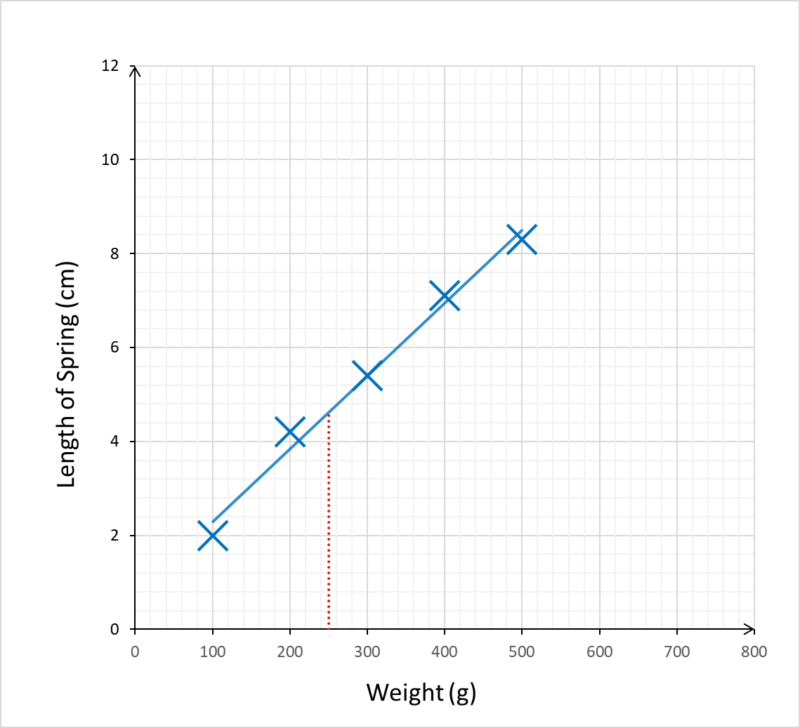
Now rule another faint dotted line across from the line of best fit until you hit the y-axis.
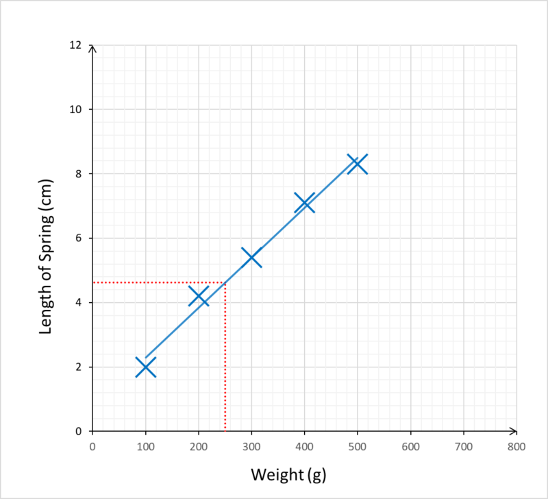
We can conclude that the length of the spring is likely 4.6 cm when the weight on it is 250 g (Teachers will usually accept any answer within a reasonable range, e.g. 4.5-4.8 cm).
Using the line of best fit to make a prediction that is within the range of the data you already collected (between 100 and 500 g in this example) is called interpolating and is usually pretty accurate.
But what if we want to know what the length of the spring would be if the weight were 700 g? What about zero grams? To do this, we need to extend our line of best fit. Use a dashed line to show that you’re going beyond our data range. Then we can read the zero gram value from where the line of best fit crosses the y-axis, and use the same ‘working out’ method that we used before to find the 700 g length.
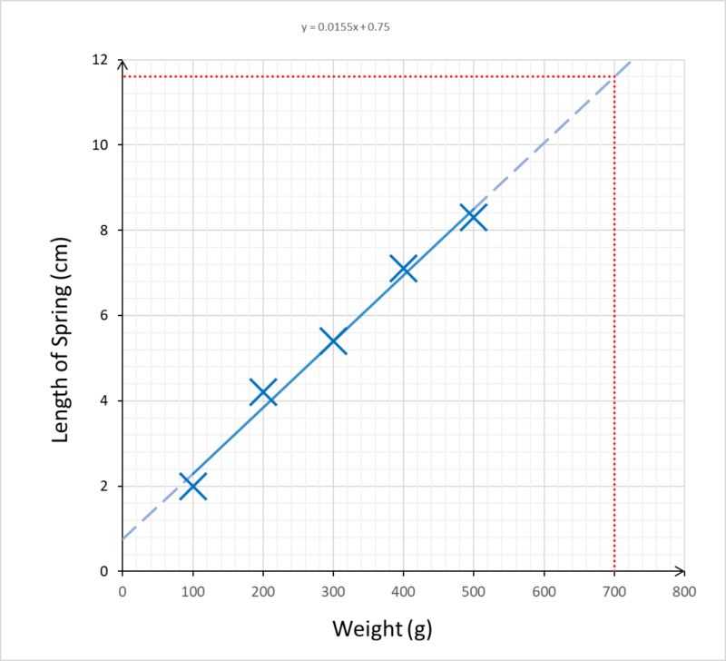
When there is no weight on the spring it should be around 0.75 cm long. When it has 700 g on it it should be around 11.6 cm long.
This prediction technique is called extrapolating, and it can be less accurate than interpolating. For example, there is a maximum length the spring can actually be (the length of the wire it’s made of), but an extrapolated line can go to infinity. Because these two values from our example are pretty close to our measured data, it’s probably ok.
What if our line… was a curve?
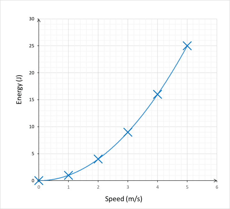
This is allowed! Some natural trends really are curved like this. These graphs are harder to draw, but your teacher could still ask you to read values off the graph, so don’t forget to show your ‘working out’.
What if there were two separate trends in the same graph?
Once again, this can really happen, and if so, we can draw two separate trend lines! Looking at where the extrapolated trend lines cross over can be really important. For example, can you tell on which day this plant stopped growing?
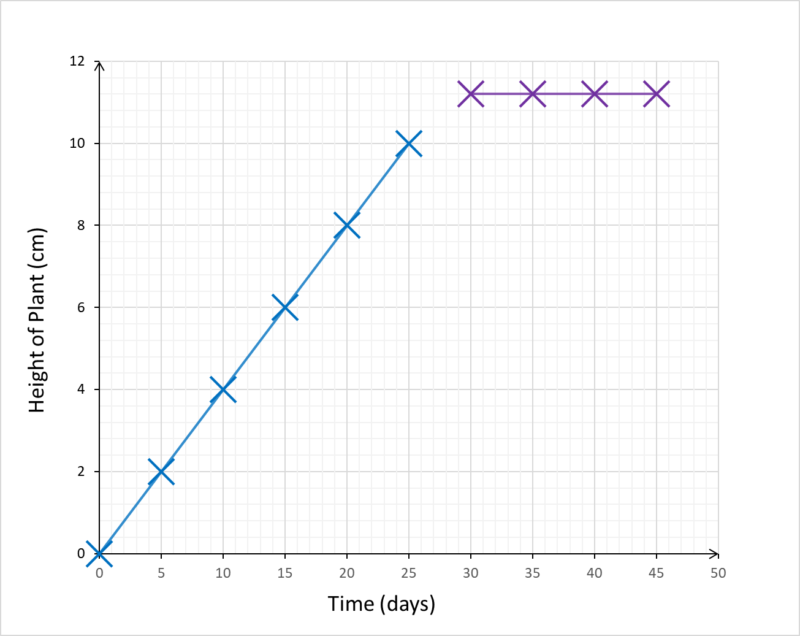
Extrapolate the lines of best fit.
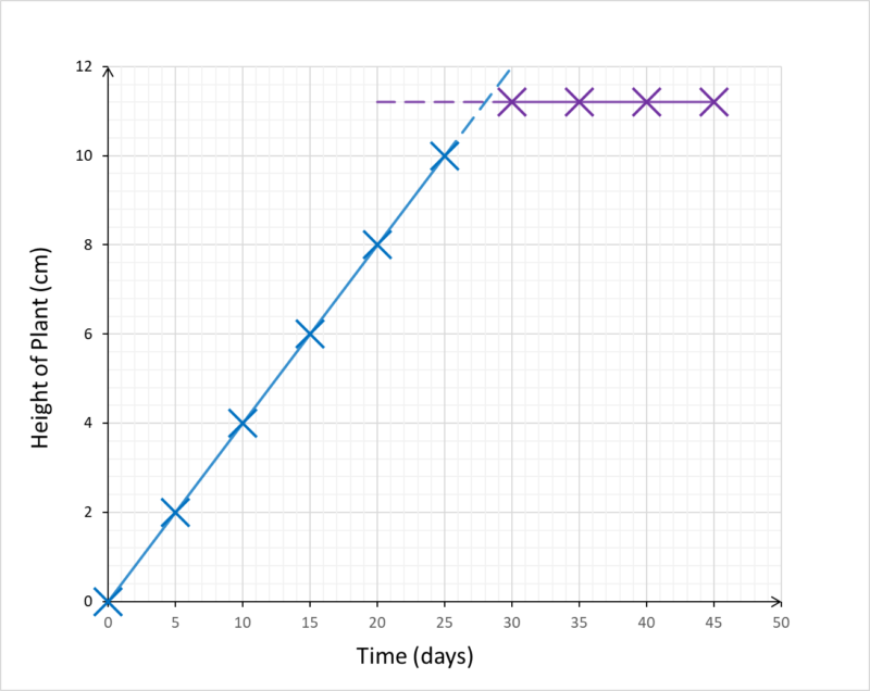
That’s right, it likely stopped growing on day 28, as this is when the first trend predicted it would reach its maximum height.
You may be thinking that so far this stuff isn’t too bad, but we haven’t even covered the most common source of mistakes in graphing! We’ll leave that for Year 8 for now, so make sure you have the basic Year 7 science graph practice down now, before it’s too late!
Now that you’ve learnt how to draw scientific graphs, put your skills to the test with our free Year 7 worksheet.
Free worksheet to help you read and understand science graphs! Download your free graphing practice worksheet
Written by Matrix Science Team
The Matrix Science Team are teachers and tutors with a passion for Science, across Biology, Chemistry and Physics, and a dedication to seeing Matrix Students achieving their academic goals.© Matrix Education and www.matrix.edu.au, 2025. Unauthorised use and/or duplication of this material without express and written permission from this site’s author and/or owner is strictly prohibited. Excerpts and links may be used, provided that full and clear credit is given to Matrix Education and www.matrix.edu.au with appropriate and specific direction to the original content.