Welcome to Matrix Education
To ensure we are showing you the most relevant content, please select your location below.
Select a year to see courses
Select a year to see available courses
In Section C, you won’t always get just a written piece. You might also come across a multimodal text, like an advertisement, a poster, an infographic, or even a cartoon or political meme. You will need to analyse what’s being said and shown through visual devices.
Visual elements can be just as persuasive as words. They’re often used to spark emotions, guide attention, or reinforce the writer’s message.
So if you want to impress the markers, you need to understand visual devices, just as much as you understand literary devices.
This section is Part 2 of our VCE English Literary Techniques Guide, read Part 1 here.
Table of contents:
Visuals are powerful. Our brain processes images faster than text and can provoke a strong emotional response in just a second. That’s why writers and creators use them to:
For these reasons, the VCAA English Study Design (Unit 4, Area of Study 2) expects you to analyse them as persuasive texts, just like you would any literary persuasive technique.
Below is a list of key visual techniques that often show up in multimodal texts, along with examples and what to look for when you analyse them.
What it is: Colour is a powerful visual tool. It can create mood, suggest symbolism, or subtly influence the way we perceive people or ideas.
Common uses:
Ask yourself: How does the colour choice support the tone or message?
Example:
In an ad about bushfire preparedness, the background is dominated by deep reds and oranges. This creates a sense of heat and danger, reinforcing the urgency of taking action before summer.

How to analyse:
The use of orange and black in the background evokes feelings of heat, alarm, and imminent danger. These colours reinforce the text’s urgent tone and position the viewer to act before it’s too late.
What it is: Camera angles influence how a subject is perceived, often used in images of people or settings.
Common uses:
Example:
A political cartoon shows a leader from a low angle, towering over a crowd. This makes them appear dominant or even authoritarian.

How to analyse:
By positioning the subject from a low angle, the cartoon amplifies their power and control. This visual framing suggests dominance and may provoke concern or criticism in the audience.
What it is: This refers to how the elements of a visual are arranged—where the text, images, and headlines sit on the page.
Things to watch for:
Example:
In a public health poster, the headline “Wash Your Hands” is large, bold, and centred. Below it is an image of bacteria magnified. The layout ensures the message is immediate and attention-grabbing.

How to analyse:
The bold, central placement of the heading ensures that the viewer’s eye is immediately drawn to the key message. This layout enhances the urgency of the message and ensures it is not overlooked.
What it is: Visual cues from people’s faces and body posture help convey emotion, intent, and attitude.
Common uses:
Example:
In a charity ad, a child is shown with teary eyes and a solemn expression, holding an empty bowl.

How to analyse:
The child’s facial expression conveys sadness and vulnerability, appealing to the audience’s compassion and prompting feelings of guilt or urgency to donate.
What it is: The choice of font, size, colour, and boldness of text.
Why it matters:
Example:
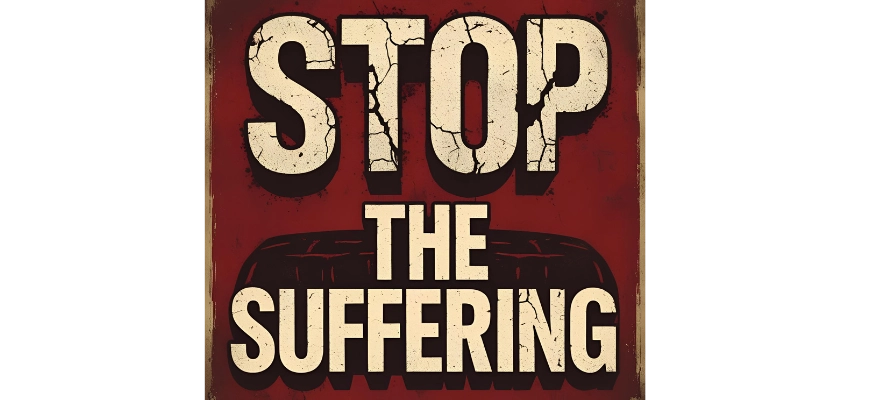
A poster against animal cruelty uses bold, block letters for the words “STOP THE SUFFERING,” with a distressed font that looks cracked or worn.
How to analyse:
The cracked, bold typography visually mimics pain and damage, reinforcing the poster’s appeal to pathos and creating a tone of urgency and seriousness.
Visual analysis uses pretty much the same process you’d apply to literary technique analysis; just with what you see. Here’s a quick step-by-step guide:
Start by asking yourself, “What stands out visually?”. This will help you clearly identify the visual device. Don’t just describe what you see – name the technique clearly.
For example: “The image uses a low camera angle…”
What does the visual device suggest? Does it symbolise something? Does it support a tone or theme?
For example: “This suggests dominance and authority.”
How does it make the viewer feel? What kind of reaction does it prompt?
For example: “This positions the audience to feel threatened or powerless.”
Tie your analysis back to the creator’s message. How does the visual support the text’s purpose?
For example: “This reinforces the argument that the current leadership is dangerous.”
The image uses a low camera angle to depict a political leader towering over a group of smaller figures. This visual technique suggests dominance and authority, making the leader appear powerful and potentially intimidating. The choice of angle positions the audience to feel threatened or powerless, evoking concern about the leader’s control. This reinforces the creator’s broader argument that the current leadership is overreaching or authoritarian, prompting the audience to question or oppose their authority.
A step-by-step guide to writing exceptional textual analysis essays for VCE English. 
FREE VCE Text Analysis Essay Guide
To really get confident with your analysis skills—written and visual—it comes down to practice. Here are some quick tips to help you prepare effectively:
Analyse a mix of ads, posters, news graphics, and social media posts. Try to identify one or two visual techniques and write a short paragraph for each. The more exposure you have to visual texts, the better your pattern recognition becomes.
Section C gives you around 30 minutes to analyse one text. That’s not long. Set a timer and practise writing 1–2 body paragraphs where you integrate written and visual techniques.
Check out VCAA sample papers and look at Matrix high-scoring student responses. Pay close attention to how visual techniques are woven into paragraphs—not treated as an afterthought! You’ll start to see patterns in what strong responses do well and what to avoid.
Add a visual text or multimodal analysis to your study plan at least once a week. Over time, it’ll become second nature.
Q: Do I need to analyse visuals in every Section C response?
Not always—only when the text includes visual features. If it’s purely written, focus on language. If the task presents a multimodal text, such as an ad or infographic, then you must analyse visuals to fully meet VCAA’s assessment criteria.
Q: How many visual techniques should I include in Section C?
While the Study Design doesn’t specify an exact number of techniques, it emphasises depth of analysis, audience positioning, and the effectiveness of persuasive features. Aiming for 2-3 strong visual techniques will allow you to make an in-depth analysis in the given time. Quality over quantity.
Q: Can I put visual and written techniques in the same paragraph?
Yes, you can include both visual and written techniques in the same paragraph, but only when they clearly work together to support the same idea. Make sure your analysis stays focused, and don’t force them into one paragraph if it disrupts clarity. Separate paragraphs are better when the techniques serve different persuasive purposes.
Q: What if I don’t know the technical term for something I see?
That’s okay. Just describe the visual element clearly and explain its intended effect. A well-explained point in plain language is better than misusing a technical term incorrectly or vaguely.
Now that you’ve built your skills, you’re in a strong place to tackle unseen texts with confidence. Whether it’s a persuasive article or a multimodal ad, you now know how to break it down, analyse its techniques, and write responses that hit the mark.
© Matrix Education and www.matrix.edu.au, 2025. Unauthorised use and/or duplication of this material without express and written permission from this site’s author and/or owner is strictly prohibited. Excerpts and links may be used, provided that full and clear credit is given to Matrix Education and www.matrix.edu.au with appropriate and specific direction to the original content.